Reports
Reports can show you accumulated device metrics over a defined period of time. This will allow operators and managers to see a trend line of how performant their factory floor is operating. The statistics you set up depend on your device data. As examples, you could measure how much downtime in minutes your devices accrued over the past week and compare it to how many alerts were triggered each day.
Navigation
- On the left side nav, click Fleets .

- From the mid-navigation bar, click Reports and select a zone from the dropdown.

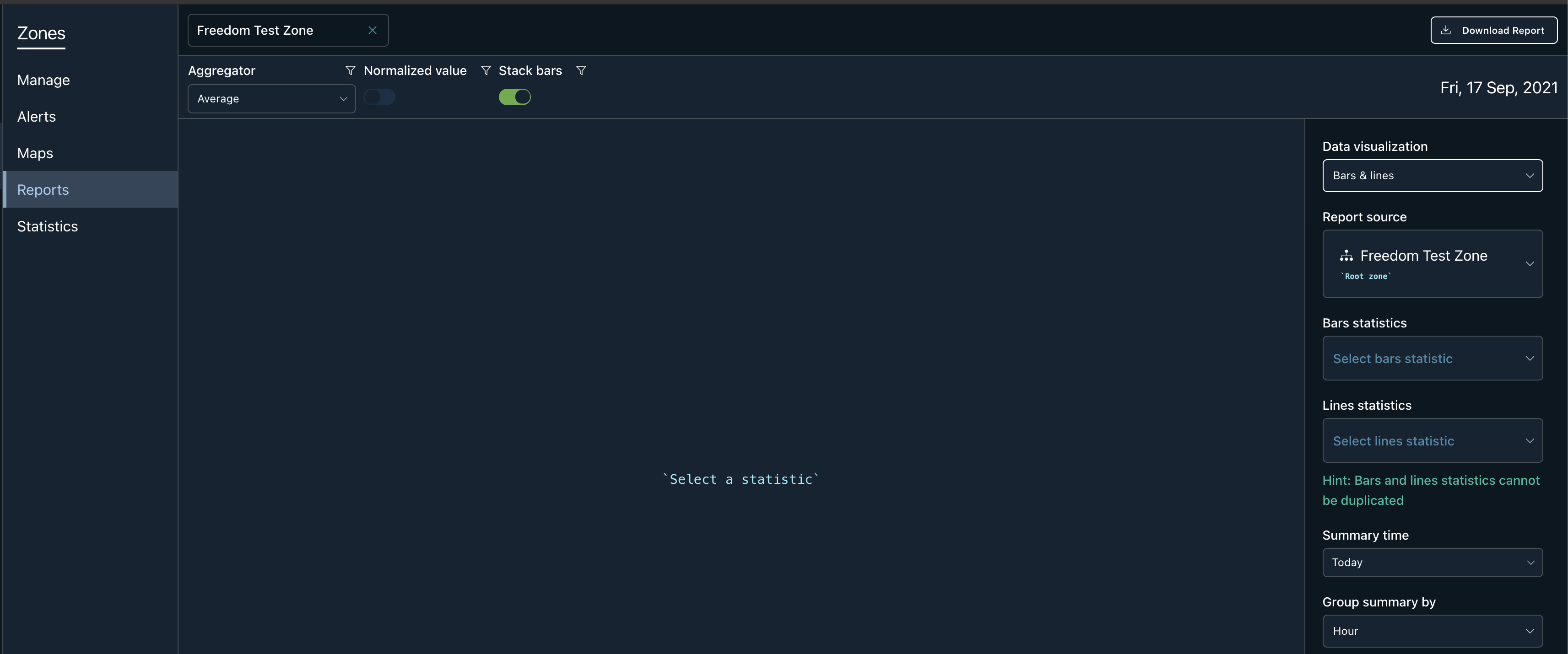
- The reports page will load with the zone selected.

Overview
Name Input
The first input on the top left is the name of the zone:

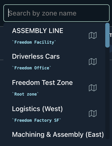
It is editable, and by clearing out the input, you have the ability to search for another zone. Once the desired zone is found, you can click on it to load its report page. For example,

Download Button
This will download the data in csv format.

Report Filters
| Aggregator | Will combine data points by the type selected. If it is average, the data points will be summed and then averaged based on the total number of data points. Sum will be a total collection of all data points. |
| Normalized Value | It will scale the values and rescale them so that they end up ranging between 0 and 1. |
| Stack Bars | A toggle switch that will stack the bars instead of grouping them side by side. |

Report Form

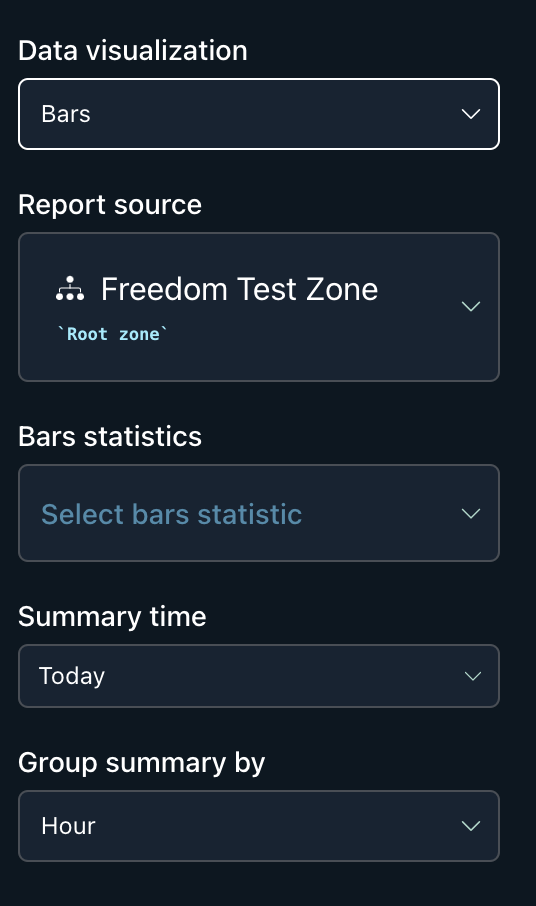
| Data Visualization | Is the type of graph you want to see in the report. You have the ability to generate bar, line, and a combination of bar and line graphs. |
| Report Source | The targeted zone or device that the report will be based off of. |
| Bar Statistics / Line Statistics | The individual statistic you want to be rendered in a bar or line graph. Statistics that fill this dropdown are created from the source's device settings. |
| Summary Time | The time range you want to view. By default it will include Today. The following options are available to you: today, a week, and a month. |
| Group Summary By | The data presented will be grouped by the option selected. The following options are hour, day, week, and month. |
Bars and Lines
This data visualization will allow a user to choose 2 independent statistics and associate them to the line or bar graph.

Updated almost 4 years ago
